Graphic Design & Branding
The brand needs to look modern, fresh and exciting
It has to look unique when compared with other county events
It needs to represent Sussex and what it’s known for in some way
Branding & Identity Design
It was explained to us very early on that we absolutely had to tackle the issue of people making the wrong assumptions about the event. They didn’t want Sussex Day to be seen as running a boring and out-dated type of event which had a limited, and predictable, range of activities that were clearly targeted at those in their 40s, 50s and 60s. In order to make this event succeed they realised they needed to make it an enjoyable day out for the whole family. We had to make sure that this brand made it clear Sussex Day was coming, it was going to be fresh, something different and something that everyone could attend.

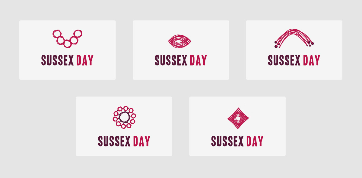
Concept Design & Exploration
We spent time coming up with several different concepts and exploring ideas that represented Sussex Day for what it was. We had a lot of fun discussing how each brand mark made people feel, what it meant to them and what people felt was being promoted.
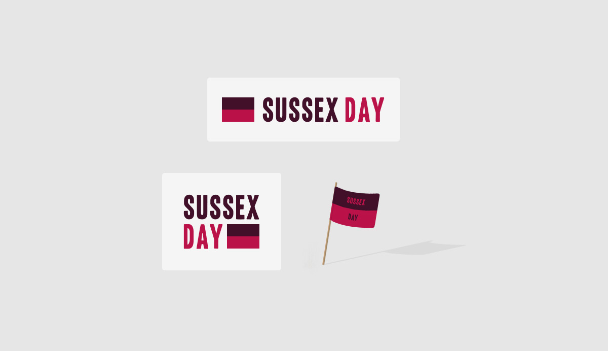
Sussex Day – Flag Concept
Because of the large physical presence of Sussex Day, and being representative of the entire county, we developed an idea that focused on using its own flag to grab peoples attention and stand out. Large flags could be flown to signal the participation of Sussex Day, allowing for the brand and the event to be recognised easily at a distance. It was an interesting concept and we’re sad it wasn’t chosen!
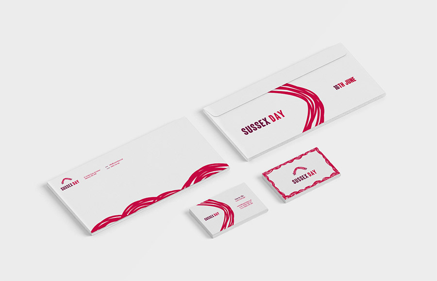
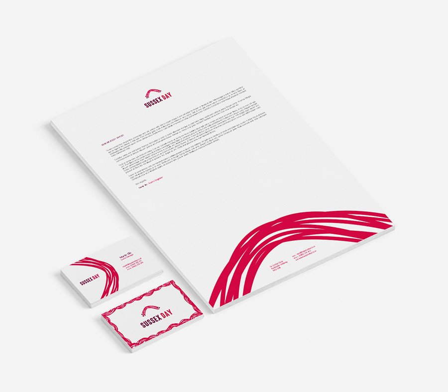
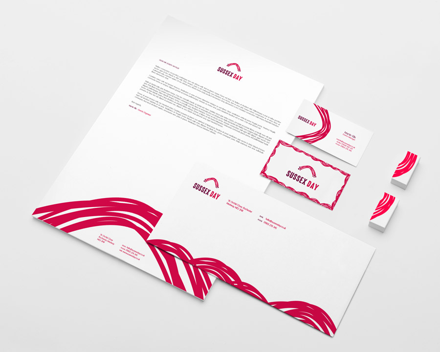
Bold. Bright. Modern.
The Sussex Day brand was very likely going to be seen in a busy environment with many distractions. We had to make sure that people could still identify the brand whilst making sure that it didn’t completely over power everything else. To acheive this we made good use of strong and vibrant colours against an always white or light background.